Friday, April 25, 2014

Poster

For my poster, I started by layering two different gradients in the background. I then used some photos of pieces of artwork to represent those who are entering work.  I used some brushes to add on top and then used some cool fonts for the title and other information. I thought this was a good project because we were able to use gradients, pictures, text/ fonts, and brushes and use everything we have learned about photoshop.

Tuesday, April 22, 2014

Brush Effects Tutorial

This was a fun tutorial to experiment with the light render tools, background gradients, and brushes. I liked changing the girls appearance and colors as well as the distort and displacement tools.

Caught in Lights

I really enjoyed this project because of the many different brushes I could use as well as patterns, gradients, and backgrounds. I used a photo of my sister dancing and incorporated  her into the photo by altering the colors to coordinate with the theme and wrapped a light brush tool around her. I also used translucent gradients over her face and dress.

Friday, April 11, 2014

Survival Illustration Friday


For the word survival, I immediately thought about how in times of need, planes will drop supplies down to the people to help them survive and rebuild; so thats what I drew.

Space


This tutorial was kind of cool but it was hard because of all the different steps that were involved. I had some trouble with the background and overlaying the gradient so I ended up lightening the gradient and then lowering the opacity. For some reason,  the picture appears lighter than it actually is on photoshop so it doesn't look as good but it still turned out cool looking.

Thursday, April 10, 2014
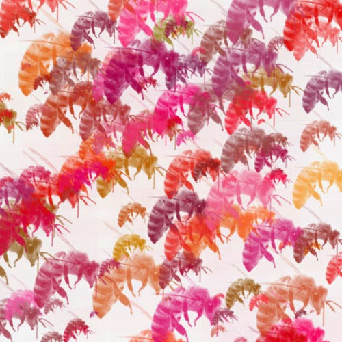
Brusheezy Brush


I really liked the Brusheezy site because it had so many options and ended up picking a pack that had famous landmarks because I love traveling. On the second one, I increased the hue jitter to give more variety to the structures. 

Brushes

For my brush, I chose to do bees and I made the jitter higher on hues so that they would appear anywhere from pink or yellow. The size jitter definitely helps make the look of swarming bees more realistic looking.

Flower Brush Tool


 I did my flowers on both white and black because I thought that with the transparent look, it would appear really cool looking on the black and stand out. On the white one, I put gray flowers in the background to make he colored ones pop in color.


Wednesday, April 9, 2014

Butterfly Symbols

I wanted to do butterflies for my symbols and I colored the original a variety of colors.  The symbol sprayer tool was really cool because there was so many changes you could make to butterflies in order to make them unique and look like a bunch of butterflies flying around each other.

Tuesday, April 8, 2014
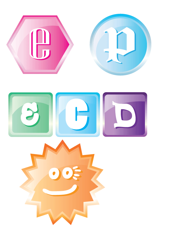
2D Buttons

I really enjoyed this tutorial because it was cool to use the transparency tool to make it lighter. I also liked making the reflection because after using the transparency tool and lighter gradients, it actually looked like a reflection. The letters were cool to do because of the many different fonts and using the different colors to make a shadow effect.

Monday, April 7, 2014

3D Logos

This was a fun tutorial because it was good practice with using the pathfinder and gradient tools. The logos actually look 3D and as though they could be real logos. The best part was playing with the different colors and gradients.