Wednesday, May 27, 2015

Final Portfolio and Reflection

 Concentration:


Breadth:


The past year in AP Art has been an amazing experience for me to both demonstrate my capabilities in art and grow as an artist. I had the chance to work more with paint and that was definitely helpful because it helped me realize how hard oils are and that I want to work more with watercolors. I have always admired watercolors and after working with them for one project, I realized how challenging they are but I still want to learn how to make an even better piece. My favorite medium, of course, is Prismacolor Pencils because I just love how the strokes blend together and how detailed I can get when drawing an intricate piece. Through Drawing class, AP Art, and working with Prismas, I have been able to enhance my drawing skills as I came to discover how to draw things as I see them and not how I think they are supposed to look. When drawing glass with pencil and I have to draw the crazy and abstract shapes and capture the vast display of values distributed throughout the surface, I see just how intricate a simple glass bottle can become. I sincerely hope that drawing glass and reflections is continued to be encouraged throughout both Drawing class and AP Art because it has helped me so much. Drawing a bottle with reflections in pencil helps me draw colors reflected off of water or glass in Prisma. Once I was finally able to draw reflections accurately, it helped me draw all sorts of things that otherwise would have been lacking if not for that knowledge. I have learned the impact of drawing warped shapes through glass and clouds reflected on a window that I probably wouldn't have been able to capture nearly as well. On my favorite piece, Hotel Studia, the windows wouldn't have looked like windows if I had drawn glass because instead I had to draw reflections of clouds and sky that gave the window a more accurate appearance. While I had the experience to draw in Prisma in drawing class, it was in AP art that I discovered its true potential as "my medium". I may not have done all that many concentration pieces in Prisma, but I still knew that it was my best medium and stood by it even when I was getting sick of Prisma.  My other favorite medium is Photography and I loved being able to make it a part of my portfolio because taking photos has always been such a big part of my life.  I only wish I had a bit more instruction in Photography because it would have been awesome if we could have had even just one week where we all took photos and focused on capturing the elements of art and themes through photos. AP Art was such a big part of my life this past year and I know I will miss having so much time for art but I am so excited to begin the next stage of my life in college. However, I will be sure to find a way to keep art in my life and in my college experience by drawing whenever I can and minoring/ majoring in some form of art!!

Wednesday, April 1, 2015

7: Hotel Studia

For the final project of this quarter, I drew this picture I had taken in Paris that had a colorful sign and all the cool architecture. I was a little worried about drawing the tree because I have never drawn that many leaves clustered together. While this project took forever to finish, I love how the buildings and the tree turned out. On the previous project Le Petit Machon, there was a railing that I drew and I love all the railings in this one because its sharp black details against the whites and browns.The shutters were kind of hard because all the black lines had to be even otherwise it wouldn't look realistic. I loved how the windows turned out with the blue tinge and the lines from the curtains inside. My favorite part of the drawing is the rust on the wall and the metal of the sign because it was the perfect shade and it turned out better than I imagined.

Wednesday, March 4, 2015

4: A Little Street after a Rain


I took this photo when we were in the Village St. Paul in Paris and it had just poured so the cobblestones area all wet and have awesome reflections. I put filter on this photo to enhance some of my colors and make the colors pop against the building's wall. Then I was messing around with the black and white filter and I put this one on which also added some more contrast which I love the look of.  I couldn't decide which photo I liked better so I included both because they both give the photo a really cool effect. As I am writing this I am realizing how much I like that colored one with all its reflections and now I think I might actually draw that one later on in Prismacolors. If I do then I will replace these with another photo and post the drawn version. There is just so much variation of colors in the image, in the cobblestones there are the tans and yellows of the buildings as well as blues and shades of green from the sky (even though with this filter, the sky has a yellow and pink tinge.

3: Graffiti Sign

For this image, I chose to keep it as photography because I love this photo and all the colors and lighting but I thought some of that and the detail might be lost if I were to try and do it in colored pencil.  I really like this because we see graffiti and stickers on stuff everywhere but you would never really expect to see it in Paris.  We know every city has it but some have less and/ or you don't really ever see it. This was a sign in the heart of Paris and while it is covered in stickers, it still has a sense of beauty to it when combined with certain lighting and its surroundings. One of my favorite parts of this picture is the pole: it may just look black but in between the grains of black and gray there are bursts of coral, yellow, orange, reds, and evens greens. I love when I capture something that doesn't actually have all these crazy colors but at the same time, it does.

5: Le Petit Machon

For this project, I finally did another Prismacolor drawing and I am so glad I did! While it took several hours each day for more than a week it was well worth it because I love how it turned out. I started with a picture of this restaurant sign from Paris and did a light outline in graphite on a cream colored paper. I am glad I chose this color paper because it really allowed me to capture the colors in the buildings and in the wall, rather than trying to get the right color, I was able to just add to the background color and focus on the texture. I did the sign first and loved how sharp the black edges turned out. The building in the back was really hard and time consuming because of the weird shapes at the top of the columns and all the shadows. I was kind of worried about how the front building would turn out but I am so happy with how it looks, LOVE IT!! I have always loved reflections and I love these ones in the windows. I also love the pop of coral at the bottom because I think it really completes both the image and my drawing.

Thursday, February 12, 2015

6: Reflective Glass

For this breadth piece, I chose to do a pencil drawing of glass bottles that were reflecting the light. I started by getting a light outline down and then put in all the light spot outlines so I would know where to not shade. I then worked my way darker and darker, slowly adding my dark shadow and lines while capturing the bright reflected spots. My favorite bottle is the sugar jar because I loved how I was able to get all the shadow and lights in the lid and in the area directly below the lid. I love drawing reflections because of all the crazy colors you see and the shapes that we wouldn't normally expect to see.

2: Neon Art Deco Sign


While downtown, I also took pictures of the neon sign outside a store called Art deco. I loved how the sign was so different from the style of the buildings and yet they both complimented each other in the photo. On the top image, I captured the sign with the buildings in perspective behind it. I added a filter that enhanced my colors giving it a warmer look. I really liked how much the warm browns were paired with the blue and they made the other pop and stand out. on the bottom photo, I took a picture of the sign from the other side and had the window, flag, and the light up building in it to go with the sign. I really loved how the dark blue of the flag went with the orange/ yellow building and the neon sign. I then put a filter on the image to blur the edges to bring the focus on the sign and its surroundings.

1: Church in Sunlight

For this project, I went to downtown Raleigh and took some pictures. I made sure to go right when the sun was starting to go down so I got some great warm lighting on the buildings. One of my favorite structures is this church that is gorgeous in any lighting but I really loved this image because the light is warm looking (even though it was probably only 30 degrees outside) and has really heavy shadows on the brick of the church. The bushes and trees, along with their shadows kind of framed the edges of the photo and I loved the effect. While I had taken many photos of the church at different angles and in different lighted areas, this one was definitely my favorite because of the light and the shadows. I also loved how the sun light up the door and the stripes of the wood really capturing the look of this old door.

Sunday, January 11, 2015

11: Architecture Photography (choice)


For my last choice project I chose to do photography and went downtown and took pictures of the old house near the community center.  I went just as the sun was setting so the lighting was phenomenal and I loved how only the top half of the house was light up.  I took a ton of pictures all at different angles and then narrowed them down to my top 12.  At that point it was hard to pick my favorites, but I managed to pick a few that I favored more and didn't use others that were at a similar angle or didn't have quite of good lighting.  After I got them on my computer, I put some filters on the photos to enhance the bright yellows and oranges in the house which really helped that sunset look that I was looking for. I don't know exactly what kind of architecture I am going to photograph for my concentration but I am really excited to have this as my first piece and I can't wait to start photographing more interesting and unique architecture.

Wednesday, January 7, 2015

10: Pet Protrait

For my pet portrait I decided to use photography and took several pictures of my dogs and of my grandma's dogs. This photo is of Fergie (not one of my dogs) who gets excited when there is a spot of light or reflection on the floor and tries to get it. When I was taking photos of her, she kept going back and forth with trying to get the spot on the ground and looking up when I called her. To me this photo really represents her personality because I can see a glint of mischief in her eyes. I also chose this photo because of the great contrast there was between the darkness of her fur and the light tree branches overlapping her face. The background was also pretty blurred out which helped make Fergie's eyes stand out despite being in the dark part of her face.

9: Parisian Street (choice)

For this choice project, I went back through my previous photos looking for an image that represented Paris to me and was a part of the actual city and not a monument or a tourist attraction. I chose this photo because it focused on the hotel sign and then I added a blurred filter around the edges to enhance the sign even more so. I really liked how you can see the cafe on the left and the man going about his regular business because you don't get the impression that just one street over are thousands of tourists and big fancy hotels. This scene wasn't created for the purpose of attraction but simply for a comfortable street that locals can enjoy.

8: Bows

 Our class participated in a Colored Pencil Magazine contest where they provided us a picture of these bows and then we had to draw them. We were allowed to alter them, crop the picture, or change the colors. I opted to draw the photo as is with the same colors just because I like all the colors looked reflecting off each other. I have always loved working with prismacolors because of how well they bland and stand out. Reflections have also appealed to me because I like using the whites to make a bright spot pop and putting colors in that you wouldn't normally guess to be in the reflection but make it look complete. My favorite bows are the gold and silver ones because they have red, green, and blue reflections throughout. This project took me a while to complete but I loved the final piece.

7: Stonehenge


For my landscape project, I chose to do the Stonehenge in ink. I had never used India ink before so I knew I wanted to use that so that I could learn to work with a new medium.  Working with watercolor on a previous project had been good practice because the ink was very similar only much darker. I decided to do a light wash of brown watercolor with splatters and splotches for the background.  I then did a light layer of the india ink for the stones.  I stippled with black ink pens overtop to darken up my values and to enhance my details.  When I was done with the inks, I went back in with the brown watercolor to put in some faint shadows under the stones to make them more 3 dimensional which really helped make the piece look more complete. While this project took me a while to complete since stippling is slow-going, I am really happy with the completed project.

Wednesday, December 10, 2014

6: Mechanical Passion Vine

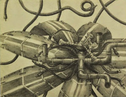
For my mechanical project I immediately thought of a passion vine because of how intricate and weirdly shaped they are. I did my project in pencil so that I could capture all the reflections of metal and show the contrast between the shadows and the light spots.  I used pictures of pipes, screw, nails, and metal plating as references so that I could really make the flower look like something you could physically hold. I also made sure to keep my light source toward the top right corner and had everything reflective point in that direction. The center of the flower has several different pieces that all look unique and so different from other flowers and I made sure to reflect that with the various different mechanical pieces I used. When I was shading, I would put a light layer of pencil down first to distinguish where I wanted the shadows and the gray areas. I then went back in with a darker pencil and greatly darkened the shadows so that they would really look like there was no light hitting that spot. After I put in the shadows, I go back in with a Knead- it eraser and take away some of the pencils so that my reflections are white and contrast with the other values. Throughout all my art classes, when I have drawn reflections, I have learned that they are the key to making metals or glass look realistic. I wasn't sure what I wanted to do in the background because it was too much empty space but at the same time I didn't want to take the focus away from the flower. I ended up putting in some cable cords that are the same as the ones that were a part of the flower which filled the space while complimenting the flower.

Wednesday, November 19, 2014

5: Self- Portrait

For my self- portrait I chose to draw myself from when I was little and found this picture of me in a swing. I really liked the composition and the colors throughout the image. I decided to draw this in Prismacolors so that I could capture all of the bright colors and textures. My favorite part of the drawing is the jacket because I really enjoyed drawing all the folds in the fabric and using the different pinks and purples for the various values. One section that was hard for me was the bark in the background because of the many lights and darks. The fact that it was slightly blurred also made it hard because I was trying to capture all the colors without taking away from me in the swing. The shoes were also difficult because the only values present were white and gray, it was hard to really make it look like shoes with only two values. The face was my hardest section to draw because I don't really like drawing facial features and it was hard to get all the proportions correct. Eventually I got the face sized right and now I really like it because it actually looks accurate to the picture. I also really enjoyed putting in all the highlights on the face, legs, shoes, and the jacket. I always love how simple splashes of white that represent the areas being light up by the sun make the drawing look so much more realistic. 

Tuesday, October 28, 2014

4: Pont Des Arts Lock Bridge


For my fourth project I chose I photo that I had taken while in Paris, France. I wanted to do it in pencil because I am more comfortable doing detail with it than some other mediums. I chose to use the theme metallic because I really like drawing and capturing reflections in the metal. I chose the picture of locks because it was one of the thing I dreamed of seeing even before I went to Paris. Couples go to the bridge and put a lock on the bridge to symbolize their love. I always thought it was a really romantic idea and wanted to capture that in my drawing. It was difficult to draw the initial shapes of the locks because of how many there were in the photo. I decided to start with the large lock towards the center and the locks near it since it had the least amount of locks overlapping it. The only real problem I had drawing it was the proportions because the paper wasn't the same proportions as the photo and when I finished some of the locks I had a lot of empty space which I just filled in with more locks from other photos.  I decided to color one if the locks with Prismacolors and use the bright pink in the photo to make the one lock stand out. In the photo, it is the most brightly colored lock and I wanted to keep that aspect in my drawing to draw attention to it.

2: Object Oil Painting

 For my object painting, which we had had to do in oils, I chose a picture of nail polish bottles. I then added a filter to the picture to alter the colors and make it look more abstract. I have never really liked oil paints both because of how thick the paint is and how much patience is required. I started by putting down the white paint to make the necks of the bottles stand out and then laid down the basic colors. On the red/ pink bottle I used a variety of reds and oranges to get the different colors throughout. On the purple bottle, I used dark and light paint to get the different purples in the glass. The orange bottle I found the       hardest because of the black around the edge of the bottle and the many reflecting colors in the glass. I decided to just try and paint it exactly as I saw it because it usually gets the best results. I am still not entirely finished because I need to add more detail to the other bottles so that the orange one doesn't look so out of place.

3: Interior Space

For my interior space project, I took a picture of the hanging shelves of shoes in my closet.  Then I enhanced the colors on the computer because I was doing it in watercolors and wanted to have bright colors to paint.  I like how each shoe that was in the picture was a completely different shape and had different colors. This was the first time I had used watercolors and I loved the results. For each color I layered the colors to make them brighter and more solid in color and in values. I really like how the red shoes in the center stand out because of the brightness of the watercolors. After I did the watercolors, I started drawing on top with pens to enhance the shapes and values. The watercolors made each shoe stand out with the colors and then the pens gave it value that completed the image. For the sneakers on the bottom shelf, they were originally black shoes, but Mrs. Rossi told me to try doing them in a different color so that there were more colors in the painting and they weren't just gray and black.The folds in the back of the shelves were hard to capture with the watercolors but once I did I really liked the results. However, when I did pen over the folds I added too much black and took away from the gracefulness and simplicity of the folds. That is one part I wish I had not done pen over or had at least done less.